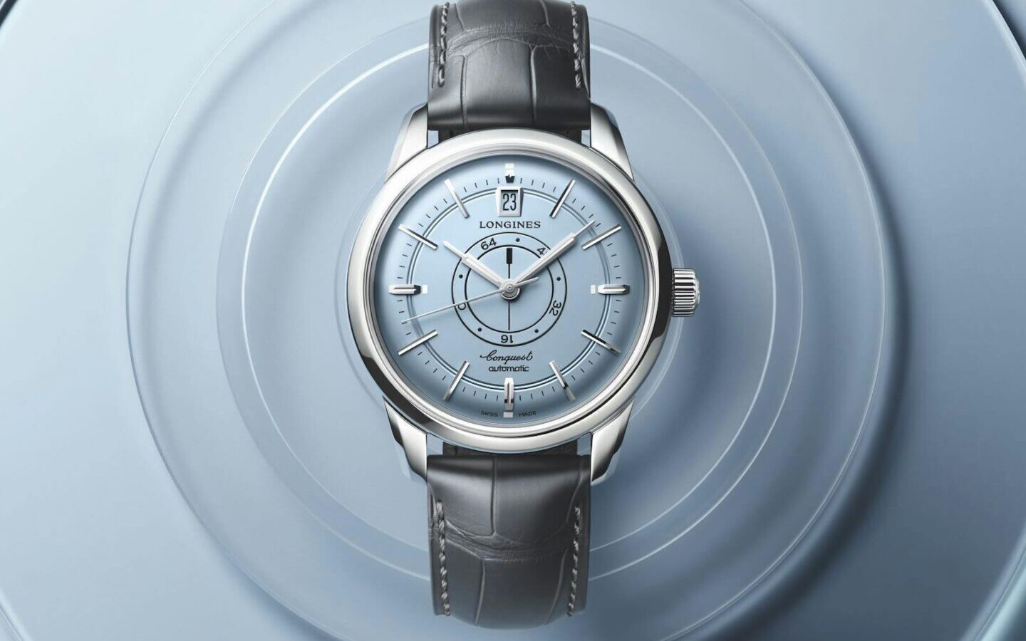
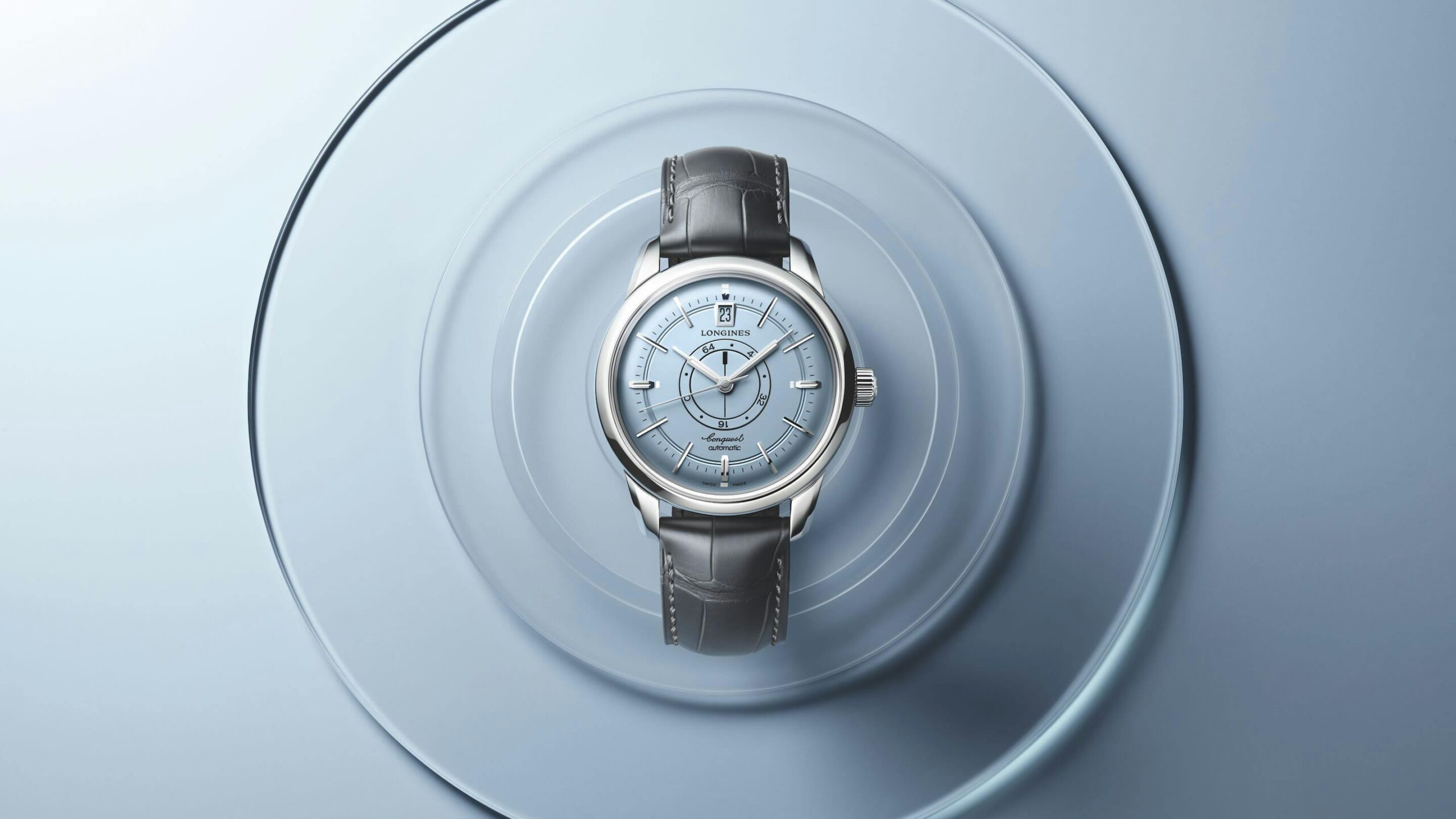
In 2024, Longines reintroduced the Conquest Heritage Central Power Reserve to mark the 70th anniversary of the Conquest collection, reviving a patented mechanical display that the brand first developed in 1959. Two years on, the same 38mm stainless steel case and calibre L896.5 movement return with one specific change: a light-blue opaline dial. That single substitution is worth examining carefully, because the dial on this watch is not a neutral background. It is an active participant in a display architecture that has no close equivalent in contemporary watchmaking.
The Original Problem the Design Was Solving
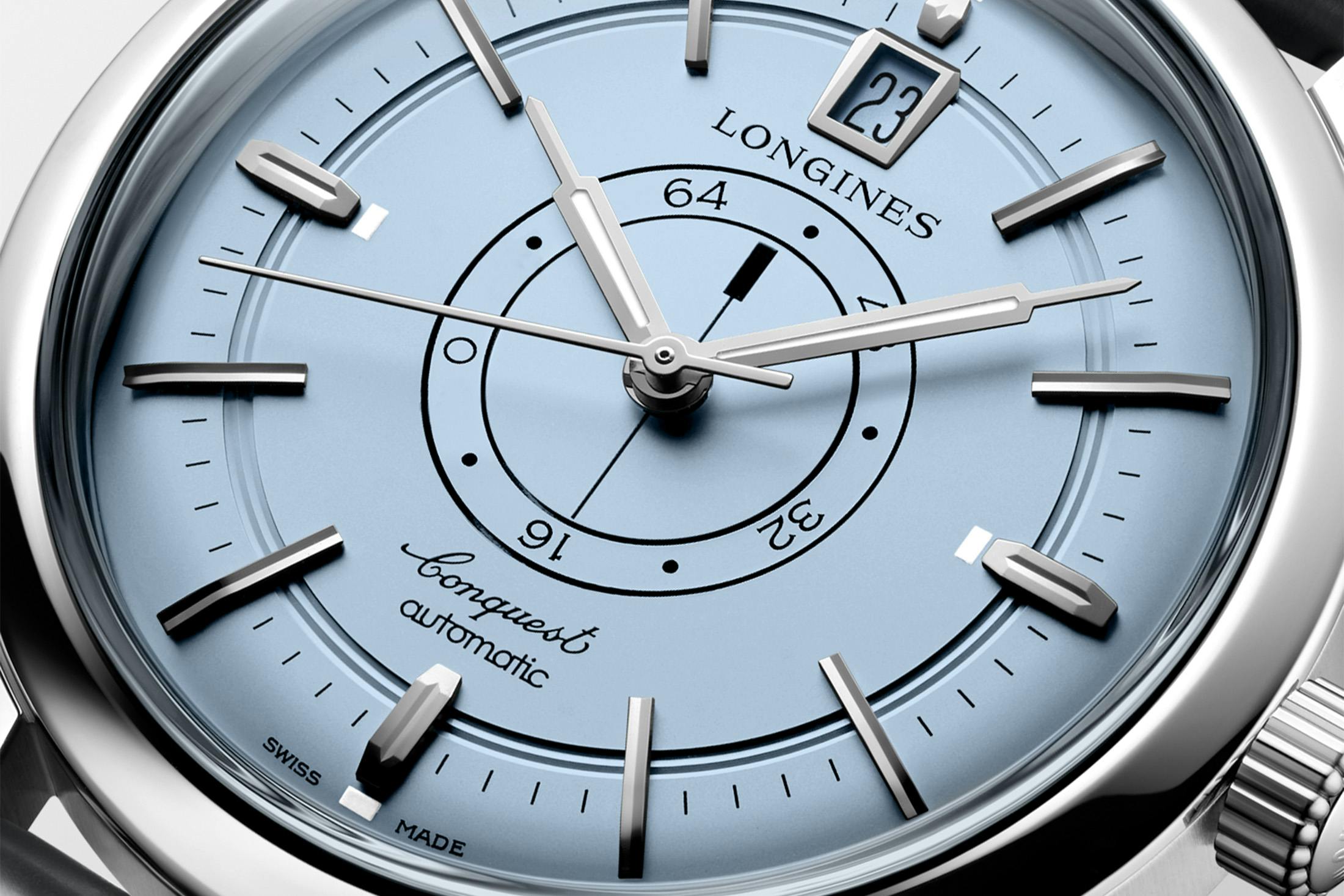
The Conquest ref. 9028 of 1959 introduced a power reserve indication built around rotating discs positioned at the centre of the dial. The solution was patented and remained exclusive to Longines. Rather than placing a subsidiary arc or sector indicator at the periphery — the conventional approach — the display occupies the visual and physical centre of the dial, where the seconds hand would ordinarily sit. The modern revival retains this arrangement exactly. Two rotating discs work in concert: as the watch is wound or worn, the outer graduated disc rotates to maximum tension; from that point, both discs move together as the mainspring unwinds, with a black baton-shaped indicator pointing toward the remaining hours. The display is calibrated to reflect the movement’s 72-hour power reserve, and it is in continuous motion.
Placing this mechanism at the centre of the dial creates a compositional challenge that no amount of peripheral decoration can resolve. Everything else on the dial — the hour markers, the hands, the date window — must coexist with a constantly moving, concentrically graduated element that demands attention by its position alone. The original solution, carried into the 2024 re-edition, relied on a dial treatment that kept the surrounding field calm enough to let the display read clearly without visual competition.
What the Light-Blue Opaline Dial Changes
Opaline dials have a particular optical quality: they are neither matte nor glossy, but carry a soft luminosity that shifts with the angle of light. On the previous version of this watch, the dial colour was chosen to anchor the central display against a relatively neutral ground. The light-blue opaline introduces a chromatic presence that the earlier version did not have, and the question is whether that presence helps or complicates the reading of the power reserve mechanism.
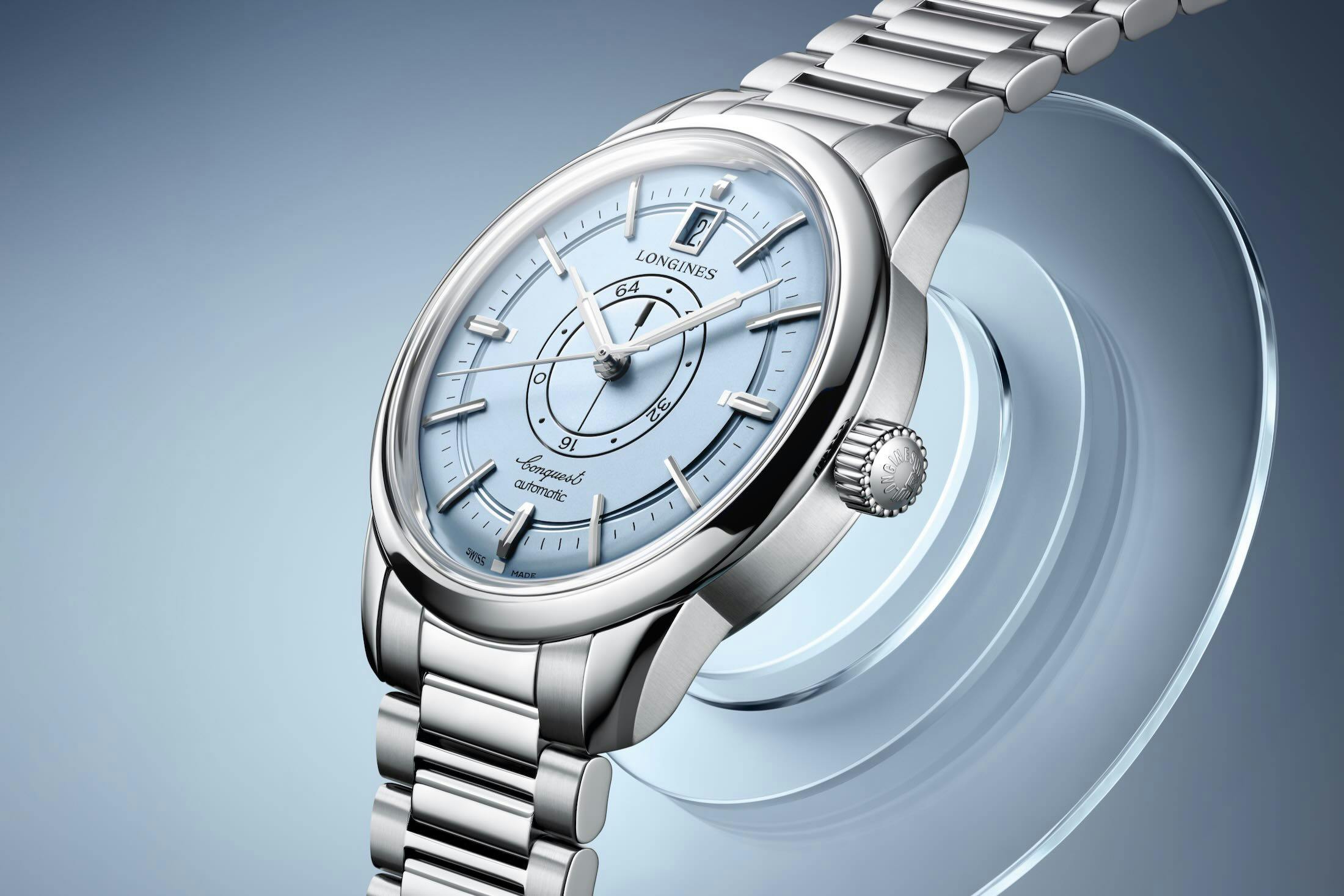
In practice, the light blue works in the display’s favour for a specific reason: it is pale enough to maintain contrast with the black baton-shaped indicator and the graduated disc markings, while the opaline surface quality gives the applied rhodium-plated faceted hour markers something to reflect against. The markers are described as pointing toward the centre — an inward-facing orientation that reinforces the dial’s centripetal logic, drawing the eye toward the rotating discs rather than away from them. The rhodium-plated skyscraper-style hands, filled with Super-LumiNova, sit above this arrangement without adding visual weight that would compete with the central display.
The trapezoid-framed date window at 12 o’clock is the one element that introduces a degree of tension. Its geometric frame is a deliberate period reference, consistent with the vintage-inspired design language, but on a light-blue ground the frame’s presence is slightly more pronounced than it would be on a darker or more neutral dial. The trapezoid shape does, however, align with the overall geometry of the dial — angular, structured, mid-century in character — so it reads as intentional rather than incongruous.
Case Construction and Finishing
The stainless steel case measures 38mm in diameter, 12.3mm thick, and 45.6mm lug to lug. These proportions place it firmly in dress-watch territory without the case becoming too thin to accommodate the movement architecture underneath. The finishing combines satin-brushed and polished surfaces, a pairing that gives the case visual definition without relying on aggressive anglage. The box-shaped sapphire crystal with anti-reflective coating on both sides is a period-appropriate choice that adds height to the profile while protecting the dial’s soft colour from reflective interference. The screw-down sapphire caseback makes the calibre L896.5 visible from the reverse.
The Movement
Calibre L896.5 is an automatic movement developed by ETA exclusively for Longines. It operates at 25,200 vibrations per hour and incorporates a silicon balance spring, which improves resistance to magnetic fields — a practical consideration for a watch positioned as suitable for daily wear. The movement delivers 72 hours of power reserve, the full range of which is communicated by the central rotating-disc display. It carries 21 jewels and drives hours, minutes, central seconds, date, and the central power reserve indication.
Strap and Bracelet Options
The watch is offered in two configurations. One pairs the case with a stainless steel bracelet featuring a double-folding clasp with an integrated micro-adjustment system. The other uses a grey alligator leather strap closed with a heritage-inspired pin buckle. The grey leather is a considered choice against the light-blue dial: it is neutral enough not to compete with the dial colour while maintaining a tonal coherence with the rhodium-plated components.
The Conquest Heritage Central Power Reserve in light blue is a permanent collection addition, available immediately. For a watch whose central design challenge has always been integrating an unconventional display into a legible, coherent dial, the new colour represents a measured step rather than a reinvention — and on the evidence of the specifications, it is a step the design logic of the original can support.